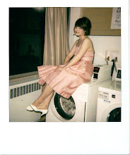
it's simple, but I think simplicity is good for this project.
Sunday, April 18, 2010

Tuesday, April 13, 2010
Style Frames
3 slightly different concepts- I stayed with the tightly kerned Helvetica Neue bold since it's instantly recognizable as relating to American Apparel. Nice branding, Dov, even though you are basically a terrible human being.


(imagine this is hand done instead of a weirdo font)


I think I like this last approach the best because it will allow me to live out my fantasy of being Joseph Muller-Brockman. Man that magenta exported crazy though.
Monday, April 5, 2010
Awesome motion graphics/ animation
http://nipple.org.uk/ANIMATION/animhome.html
Their animations for The Mighty Boosh are amazing. A great example of every frame being a beautiful composition.
Saturday, April 3, 2010
1890s

I ran into this chap from 120 years ago last night. I'm working on ads for an exhibit in a fictional museum about Victorian Travel. Does the lavender one look alright? I think the green definitely looks best, but I wanted to keep some variation since the copy will probably all be handled similarly and since it's all the same person. Maybe using just green is the way to go.
Tuesday, March 30, 2010
Roller Derby Program cover
 it's based on the Saul Bass poster for Vertigo.
. . . I think I did it justice in this homage. Saul Bass is definitely one of my favorite designers, so I try to be inspired by him as much as possible. I thought about using hand type similar to his on the original poster, but I ended up using Futura for consistency with the rest of the program. I think it worked out pretty well.
GO TO THE BOUT, IT'S SO MUCH FUN!!
Wednesday, March 24, 2010
Junior Review Poster/ music editing
1. here is my poster for junior review. It is the most foolish thing I have ever designed.
2. I finally figured out how to edit mp3s. I could use flash. . . or garageband, so I had to download Audacity. It's pretty easy to use so it's ok, but seriously Adobe, you need to make this easier!

2. I finally figured out how to edit mp3s. I could use flash. . . or garageband, so I had to download Audacity. It's pretty easy to use so it's ok, but seriously Adobe, you need to make this easier!
Subscribe to:
Posts (Atom)